Introduction to Truffles
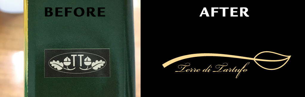
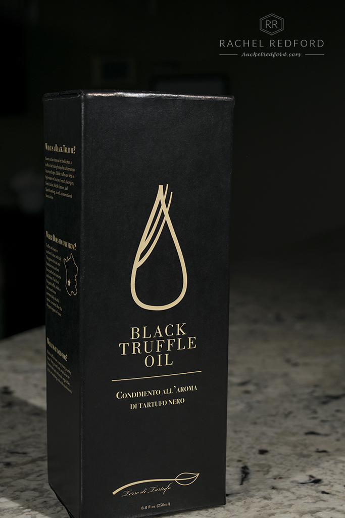
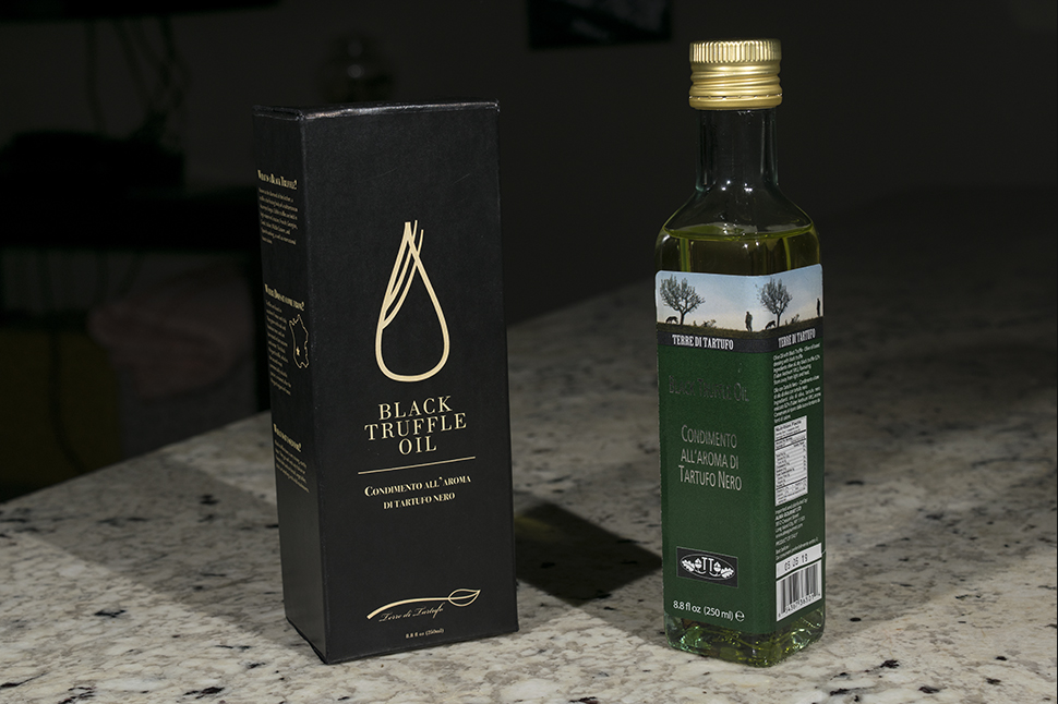
Have you ever walked through your local grocery store and noticed the packaging on your favorite products? My favorite products stand out to me because they usually have beautiful packaging. I decided that more packages in the world need better design so I chose Terra di Tartufo’s Black Truffle Oil. This high-class product’s packaging was not sending the right message to it’s audience. I also wanted to practice better physical craftsmanship since so much of design has gone digital.
Audience
The audience includes men and women ages 35 and up. These people are into haute cuisine and have expensive taste. The current packaging does not reflect their sense of style and class.
Inspiration
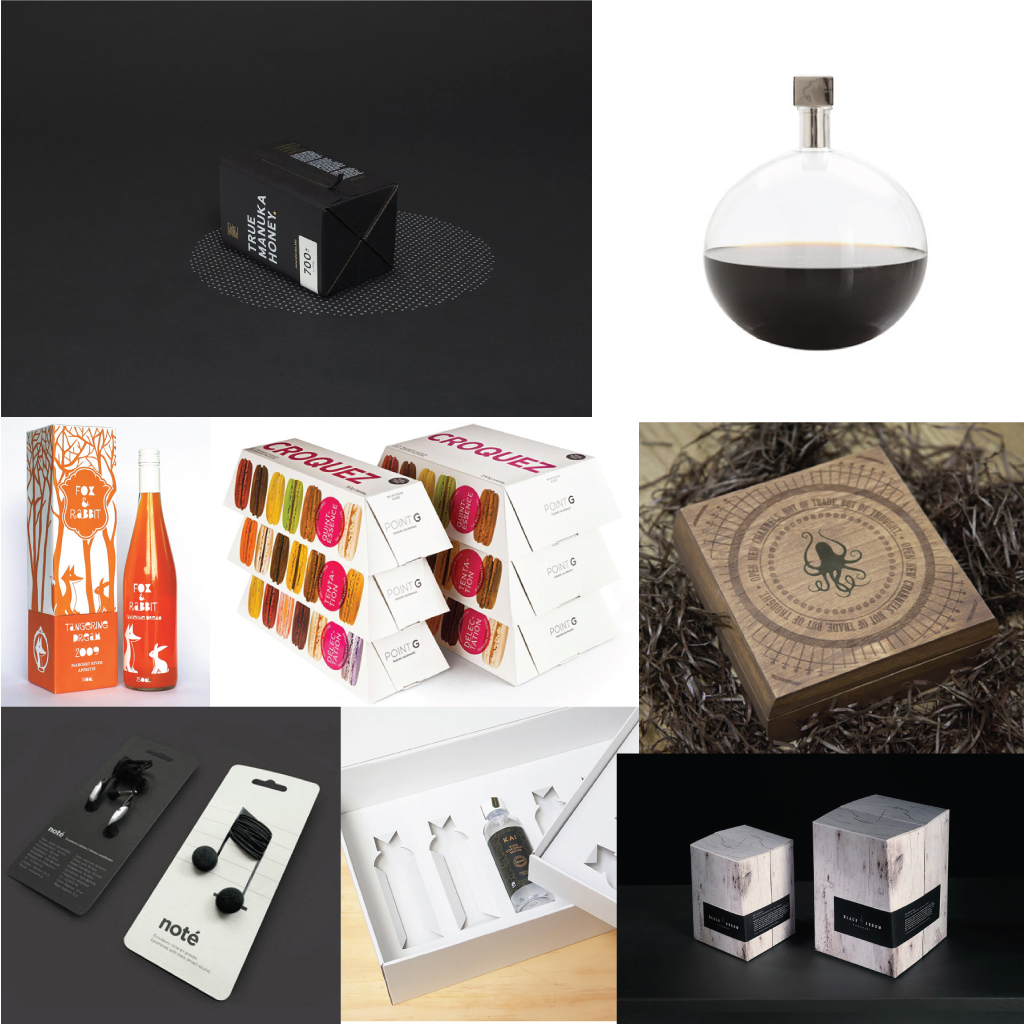
I found a lot of inspiration from Think and Creative Bloq. I looked for anything that had a classy or creative design and added it to my inspiration board found below, as well as a Pinterest board.
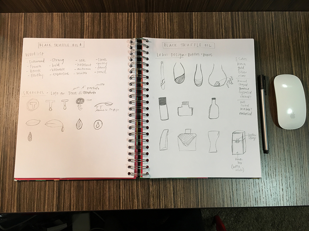
Style Guide and Logo Redesign
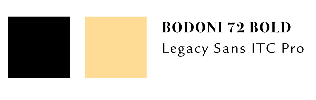
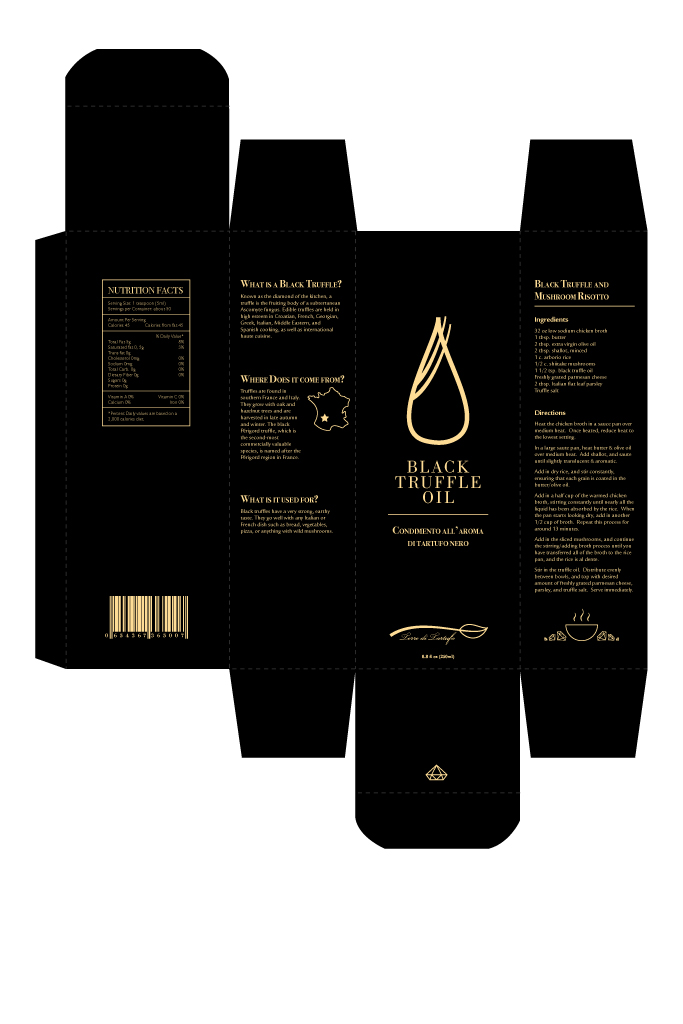
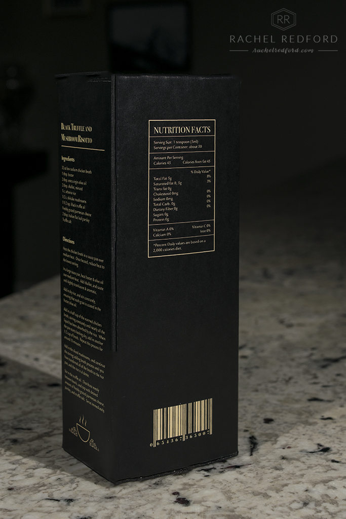
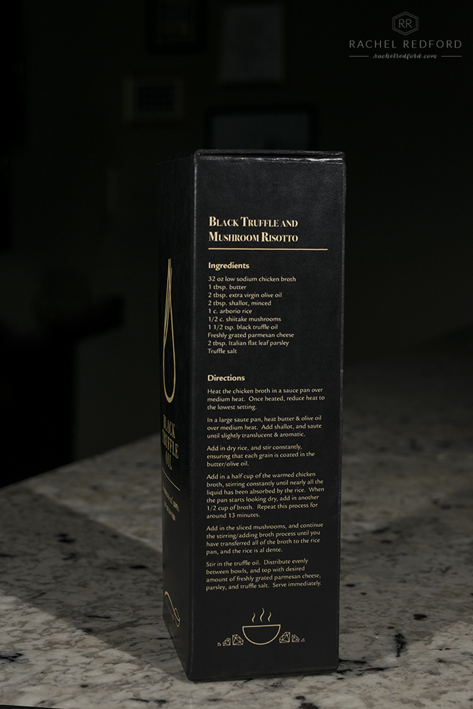
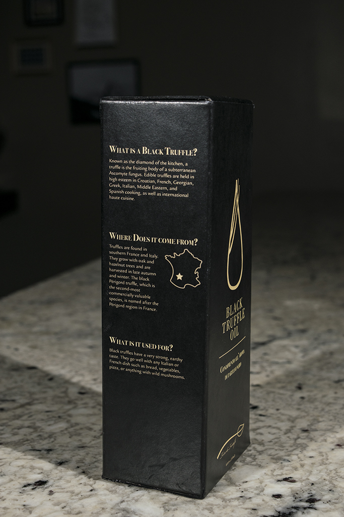
I chose black and gold for my colors because they have a very classic, expensive feel. The black box communicates a lot about the product. The gold provides great contrast against the black so everything is legible for consumers. I chose Bodoni for the main copy because it is a classic serif font with high contrast between the thick and the thins. It is usually seen in fashion magazines. I also chose Legacy sans serif for the body copy because is it classic yet highly legible. I redesigned the “Terre di Tartufo” logo to look like a branch with leave on the end.
Working through Illustrator
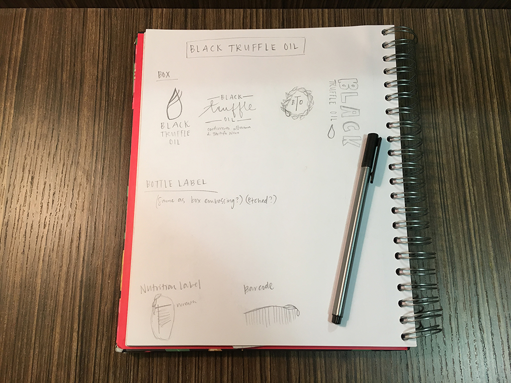
Before I even started in Illustrator, I did some sketching.
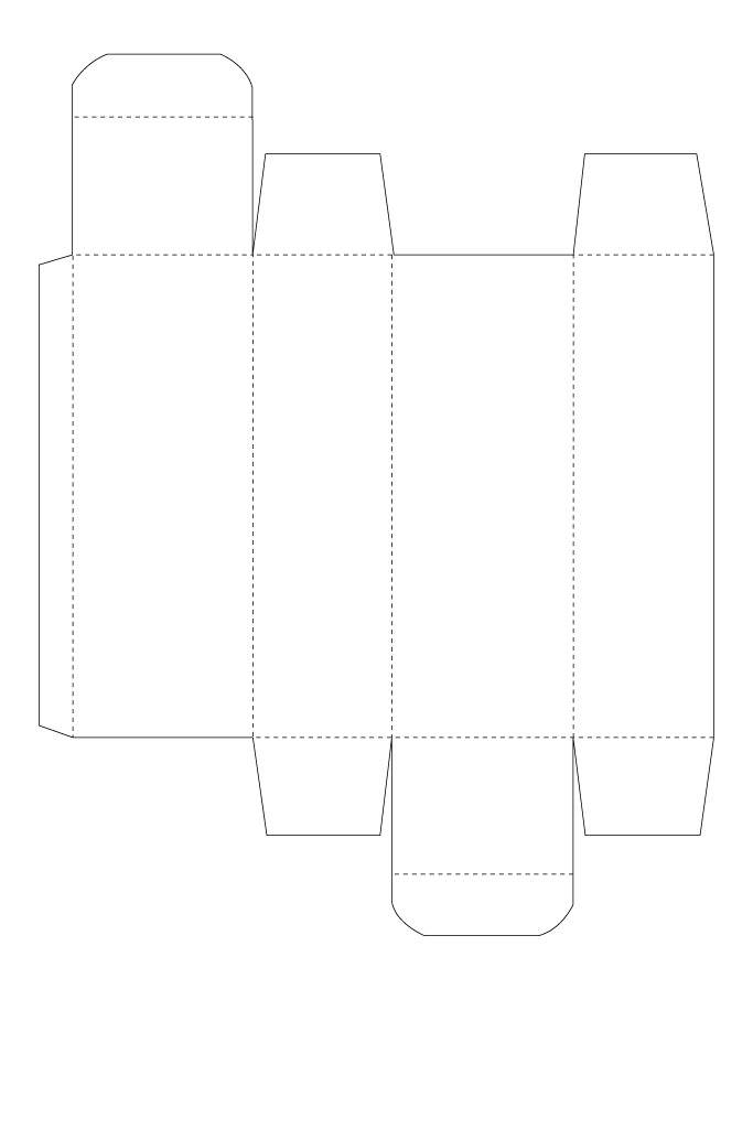
I did everything in my package redesign on Adobe Illustrator. First, I traced a box layout using the pen tool.
Then I added the black background, and started designing my logo, the graphics, and the text. Most of my information on the side panels was found on Wikipedia.
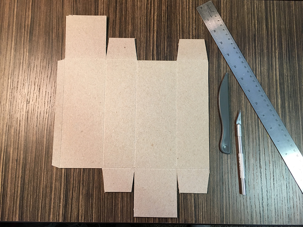
Construction Process
My first attempt at box construction did not go very well. The corners did not match up, making the box skew to the left. Also, I printed on thick, semi-gloss card stock but that cracked when I folded it, even after scoring the edges. So on the second attempt, I first bought a thick piece of cardboard and cut it out using a paper template that I made of the box.
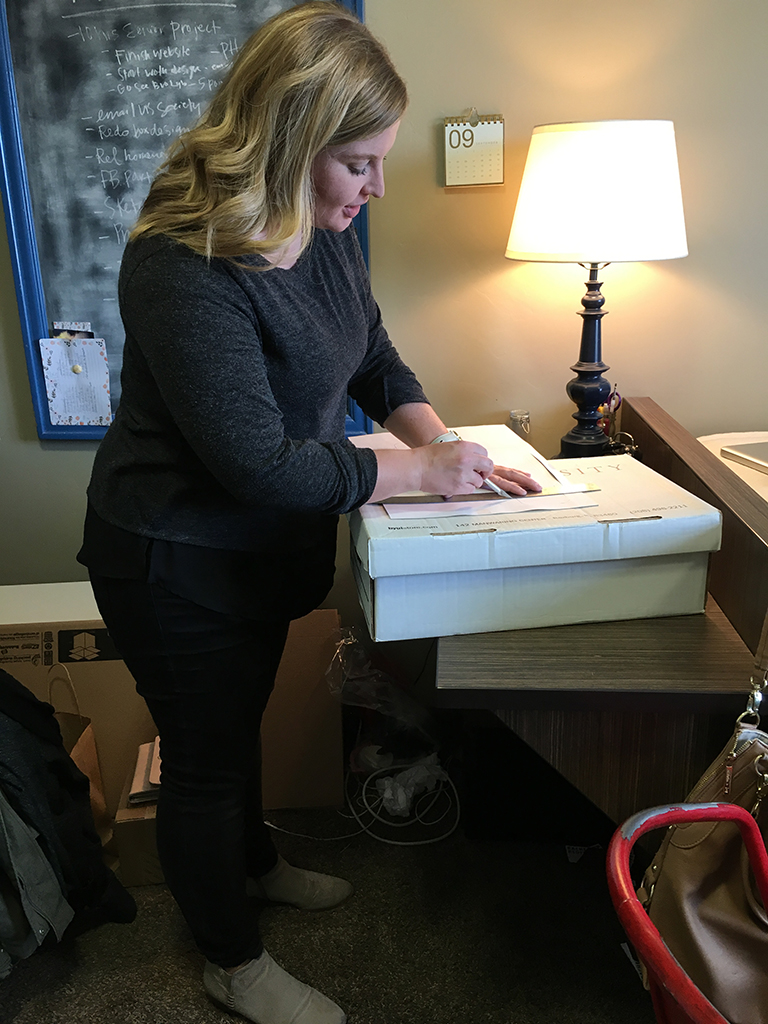
Then I cut out the my printed sticker.
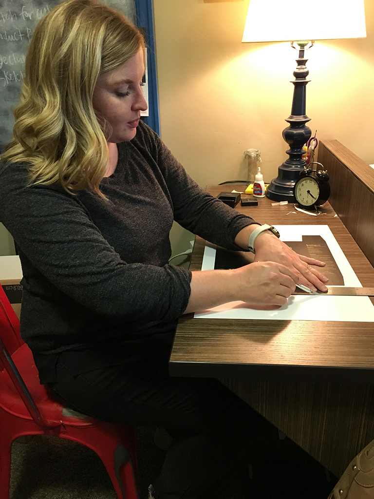
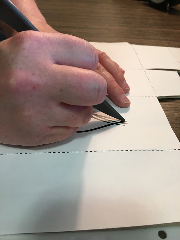
I scored all the edges and corners of the cardboard and the sticker, then I adhered the sticker to the cardboard. I did a little embossing on the giant oil drop using my scoring tool. (I put a regular sheet of paper on top as to not mess up the printing on the sticker.)
Lastly, I folded everything together and glued the matching corners together.
Final Thoughts
This package redesign will successfully meet the needs of the target audience. They will recognize that this is a high quality product that is worth their money and sales will increase for the Terre di Tartufo company.
Pitch Book
Check out my newly designed pitch book:
 Loading...